Photography tips part 2: Social Media
Imagery can cause an instant click in the web-user's mind. There are simple things you can do to raise the visual impact of your business representation on social media. Following the steps of our basic tips and tricks will take your various online shop windows from amateur, to professional, in just a few simple steps!
Let's recap from Photography tip# 1
First, let's recap! As mentioned in our ebook "23 Effective Marketing Strategies for your Hospitality Business" (we're giving it away, just let us know you want it!), visually striking content is part of the psychology of the Internet. Along with interesting written content, it a driving force of what keeps us searching and clicking. So, ask yourself, compared to the images you pursue online, the images that make you feel an emotion, how does your own social media feed hold up? Are you giving the user what you yourself enjoy? No matter the format of your online business presence, whether Facebook, Instagram, and/or a website, the goal is to represent your business or services with good quality images that:
- showcase your area (Vendee...)
- and/ or showcase your product (hospitality business or actual products)
- evoke a positive emotion (can be through colour scheme, subject, abstract, humour...)
- tell a story (your work, history, architecture, food, landscape, life event)
- or place you in that story (selfie, family picture)
- fit snugly into the space where they are used without absorbing too much bandwidth (the fancy word for this is image optimization)
In addition to the relevant story, post images should be adjusted to
the presets of the social media platform.
the presets of the social media platform.
Do you need top of the line equipment? No. If you're in the market for a new camera or cell phone, you can easily get away with last year's model for much less. In our geeky household we never buy the latest and greatest. Do:
- use what you do have, paying attention to light, angle, and composition, will go such a long way!
- fortunately with digital cameras or (the more recent) smart phones, the sky is the limit. If you have the latest equipment, you're good to go.
- create lovely composition, whether they are landscapes or indoor images or product images, create depth, space and tell a story.
THE Rule of Thumb!
The digital window equals the high street window!
The digital window equals the high street window!
Part 2: Your pictures on Social Media
1. INSTAGRAM
- an image that is 800 x 600 px inserted into a space that is preset to 1090 x 1090 px. will stretch the image and its quality will be greatly reduced.
- an image that is larger than the intended space will be cut off
- Keep an eye on articles and changes as social media entities tend to change their presets.
- The image market on Instagram is REAL and competitive.
- Research the latest in top photography on Instagram and Pinterest - in particular study the light.
- Our tips for FOOD PHOTOGRAPHY
- Some Instagram filters will help infuse light into a picture or to apply a romantic hue etc. Research trends.
- Once you decide on a style for Instagram, try to continue it. Continuity and fluidity of style is important to the user.
EXAMPLE of consistency and context
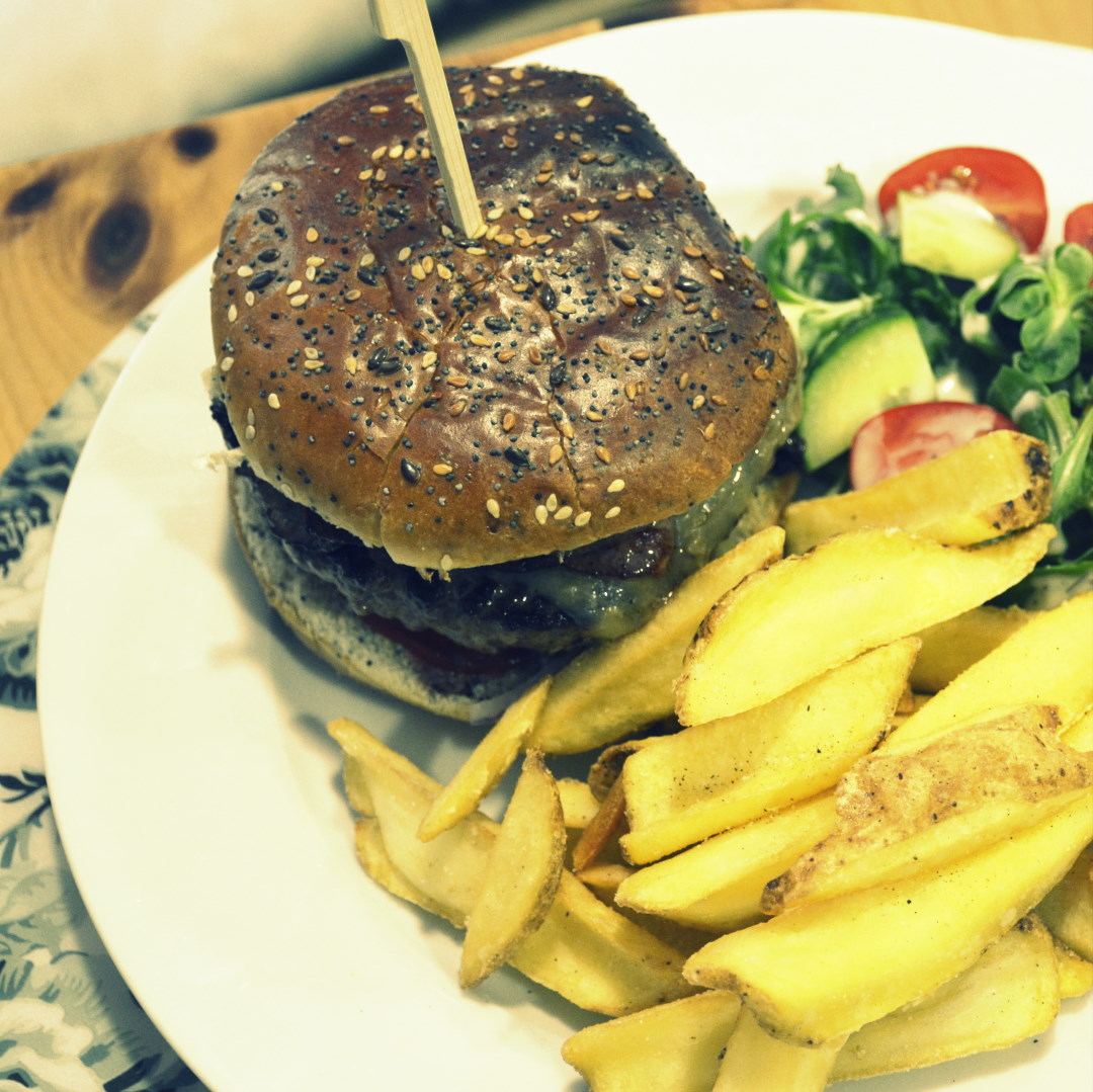
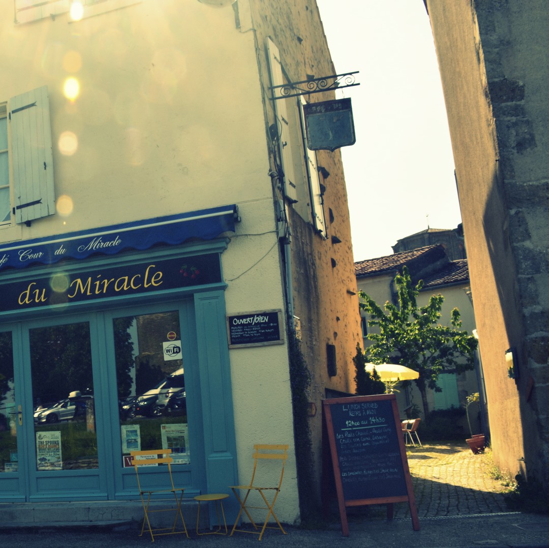
The below series of images representing a local business could easily be part of their Instagram feed - but this is just an example. The series of four represents consistency (through applied filter) in tone. The images also present the business in context to their product (food), their location in the village, and the tourism factor (scenic image). We, internet users and (potential) customers, are presented with valuable pieces of a story-arch. With just four images, we know that we can sight-see, enjoy an aperitif in the sun, and have a lovely meal in an atmospheric setting.
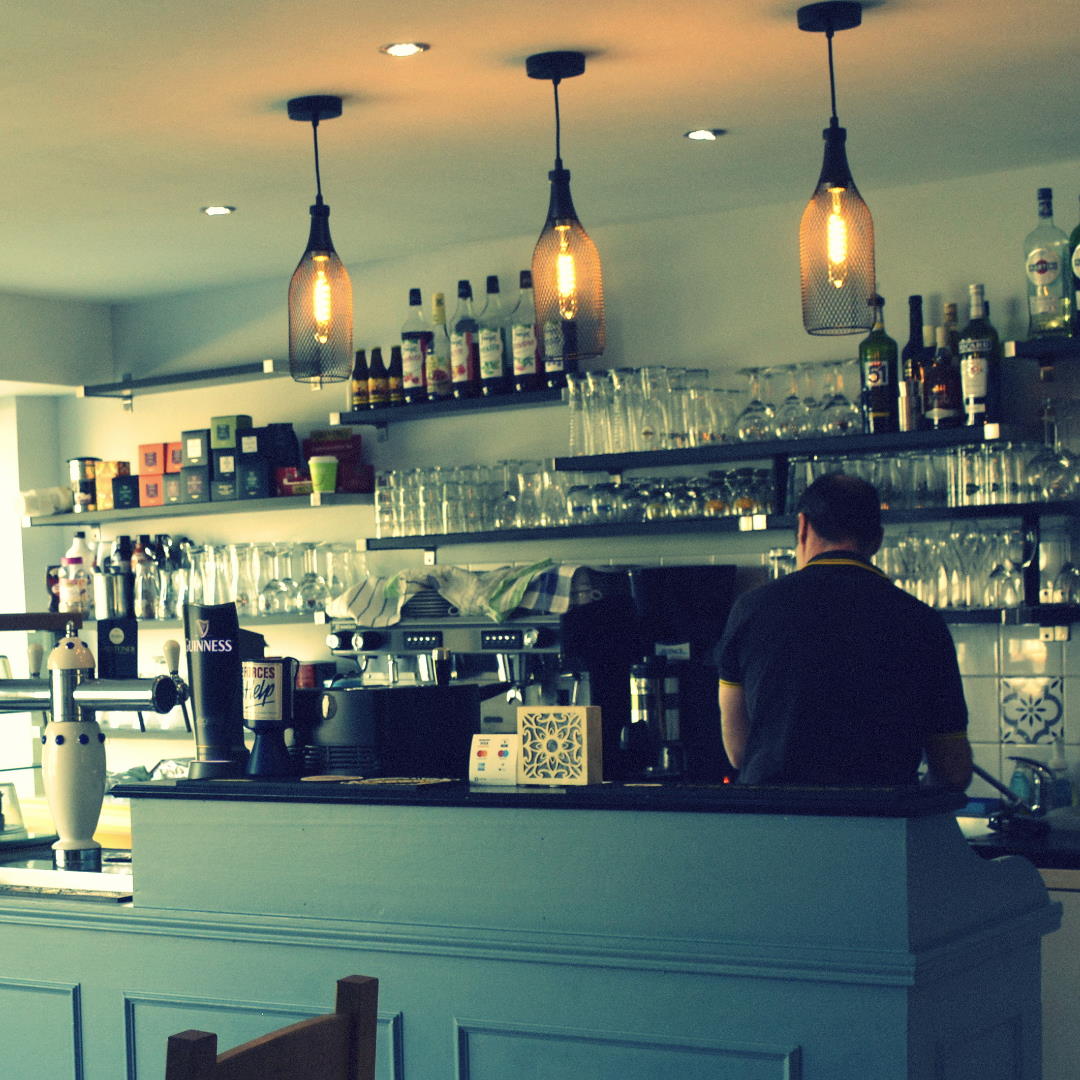

Example #1 is a good example of atmosphere. It is a dynamic picture that shows us lots of things. The interior of the bar/restaurant is both modern and old. The light from the windows and the three lamps above the bar ooze softness and atmosphere. The fact that the owner is in mid-prep with his back turned doesn't only make the image dynamic, but also conforms to current image trends. Use French cafe-culture, local restaurant and tourism hashtags.
In example #2, the light is perfect. The image speaks to the area or village where the business is located. It oozes history, inviting us for an afternoon of sightseeing. In fact, the image is a beckoning finger, not just for the cafe, but representing the local tourism office, and the village. It invites us to find out more. The image is even a bit dramatic in its invitation for adventure. Including community hashtags and tourism entities help build relationships.
Example #3 shows product representation. The user is presented with a mouthwatering in the moment, it shows what's on the menu at this restaurant, and within the overall Instagram feed, we are served with just about everything this business has to offer from atmosphere, to sightseeing, to relaxing in the sunshine and having a nice meal. Research local foodie hashtags and include them. # liquor companies and trending drinks or apero.
Example #4 places the restaurant in the village. The subject is in shadow (not ideal), but it does tell a story. The shadow is offset by a sunbeam, and the alleyway gives us a hint of a courtyard terrace bathing in sunlight. The overall image also tells us what to look for when we drive to this village for sightseeing. It is a good representation of the business and even though it's gently abstract it oozes charm. Use restaurant-cafe-tourism hashtags. (vegetarian? include info!)
2. FACEBOOK
- well-adjusted images that fit into their space correctly
- good content that tells a story or presents an offer. Or both.
- is personable without being personal
- mixes product, atmosphere, and tourist content
- is playful
- posts always have an image! Text only posts simply don't do as well even among your followers. They don't grab the scroller's eye.
- Use hashtags and involve the community where relevant, simply by @including them in the post.
Facebook Headers
Facebook Header = 851 x 315 px (change periodically or use slider feature)
Logo/ profile = 300 x 300 px (change periodically or use brand logo)
***DON'T USE an image in your Facebook business header or profile space that has absolutely nothing to do with your business. The header provides a precious opportunity to promote a service a special or an upcoming event; the logo for the customer/guest/client to connect with your smiling eyes, business facade, or brand.***
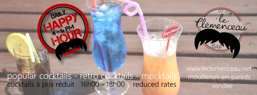
In example #5, by creating this well-adjusted image advert, and installing it in the appropriate space on Facebook, the business proprietor took full advantage of the Facebook header space to bring attention to Happy Hour. Create a new image per year or change seasonally with an appropriate setting. This image implies summer and a sunny terrace.
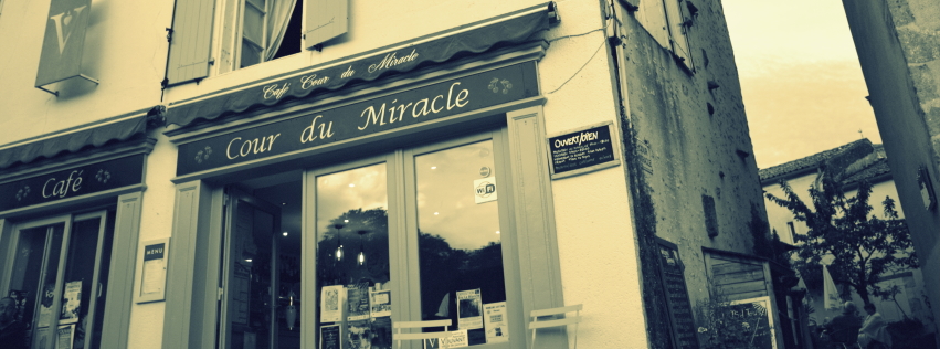
In example #6, is trendy and atmospheric. In this example, the proprietor uses the header space to convey three different business aspects: the village logo against its facade, the business itself, and a curious little courtyard terrace at the back. While somewhat abstract, the user's eyes have places to roam. In both cases the social media -and website imagery overlap, creating an overall, recognizable 'look'.
POST IMAGES (SPONSORED)
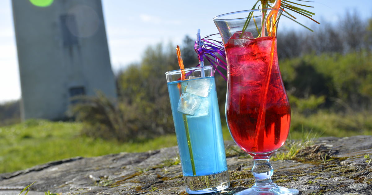
Example #7 Playfully placing your product or service in an unexpected, but relevant setting. This image is very tongue-in-cheek, yet informative. The proprietor took the time to create 'cocktails' away from the expected, placing them in an historical setting that attracts locals, tourists and leisure sports enthusiasts.
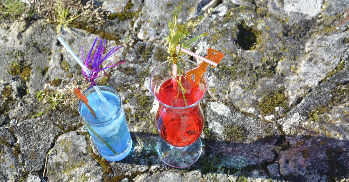
In example #8, shows the product in an abstract setting. The drinks are displayed atop an ancient millstone, providing a beautifully textured background. The picture tells less of a story but it can definitely be used in a summer-vibe post reminding patrons about your mouth-watering cocktail menu.
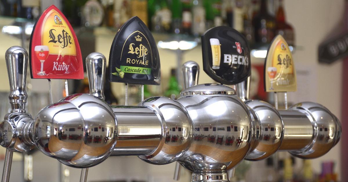
In example #9, This abstract image also shows three components. It shows the product this bar has to offer, a lovely reflection of the business setting giving us an idea of what it looks like, and in the depths of the picture we can see that there is much more than just beer to be had. This image too oozes atmosphere.
Never stop improving your social media skills and making your business page
the best, most informative, and appealing to the eye it can be.
the best, most informative, and appealing to the eye it can be.
3. Adverts
Keep in mind that the average user doesn't click on images so easily anymore. Life is busy, the breakfast dishes are in the sink, we have to see the children off to school, or the dogs need their morning walk plus there is such a huge amount of content to peruse... so we tend to scroll through our social media faster.
It is important to grab the user's attention immediately as he/she scrolls through their social media feed. When an advert is ill-presented, doesn't fit into the space, and it looks flat, people will tend to scroll right on by.
Always create adverts or posts with the user in mind. Even if it's time consuming and you've a learning curve ahead, do take the time and do make the effort. Your professionalism will be rewarded.
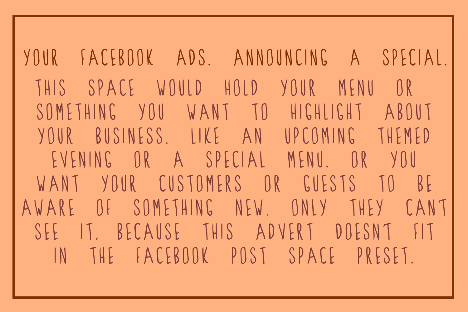
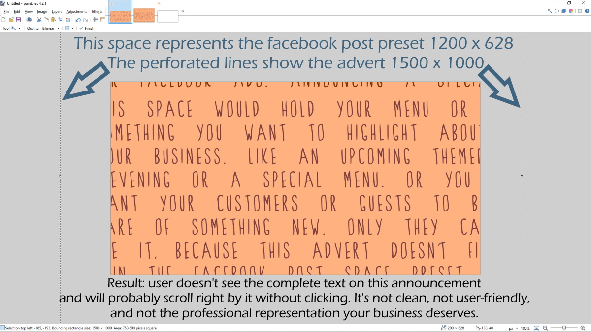
Anno 2020 the size is 1200 x 630 for Facebook (if you are currently using 1200 x 628, those 2 little pixels aren't going to make too much difference)
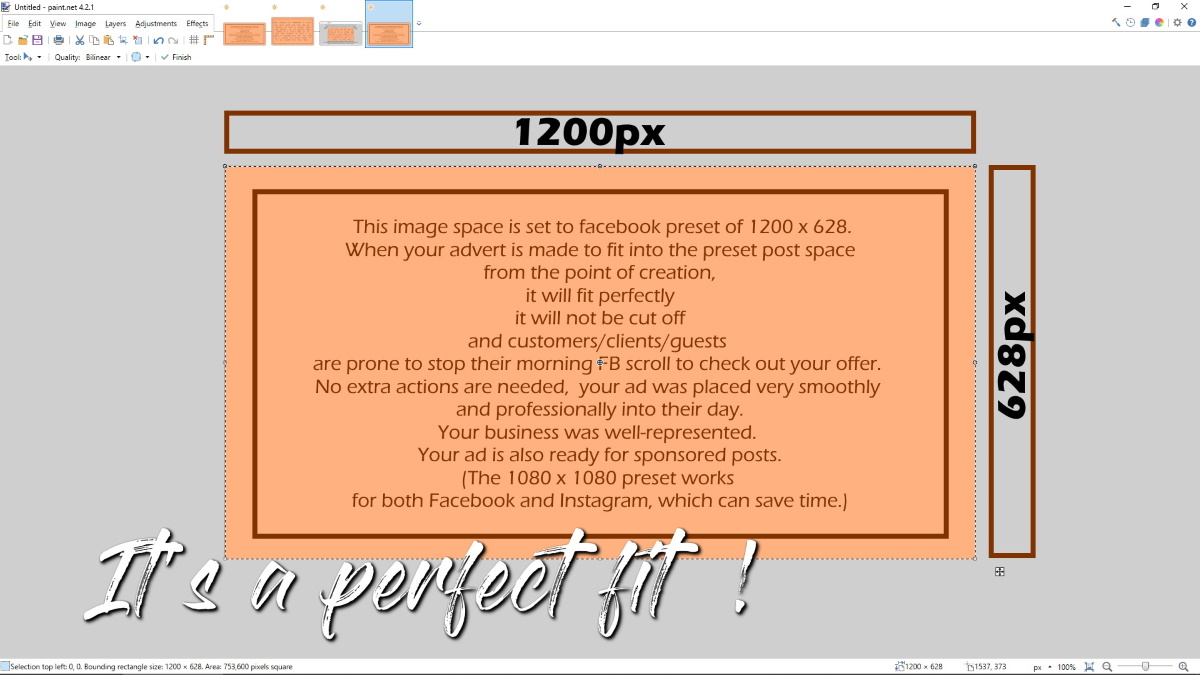
Anno 2020 the size is 1200 x 630 for Facebook (if you are currently using 1200 x 628, those 2 little pixels aren't going to make too much difference)
Part 3: Summary and helpful tools
If you had a shop, or bar, or restaurant, or a hotel on the high street... would you not ensure the windows are sparkling clean, that there are flower boxes and/or an inviting window display? Let's turn the tables... as a consumer standing before a restaurant with a dirty, seemingly neglected exterior, and right next to it a restaurant with gleaming windows, jolly umbrellas and flowers galore... be honest! Which one would you choose?
In the digital world where photography is key, a business represented with dark, unfocused/ blurry, irrelevant, tiny, grainy and badly adjusted images... is the equivalent of a dirty window in the real world. Present the (potential) customer or guest with lots of pixels, good light, and depth. Give them images that, in a glance, will leave an imprint. Make them feel like they are on holiday already. Like they want to eat your food. Like they want nothing more than to see your handmade ornament in their Christmas tree.
Landscape photography tips
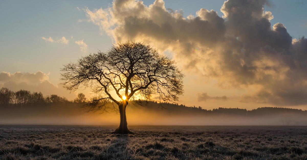
Next we show a few random landscape images depicting photography features used all the time by photographers. Our goal here is to show you the importance of giving the user's eyes somewhere to go, and the techniques used to accomplish that. In each picture, the main subject is obvious, but there is so much more to look at.
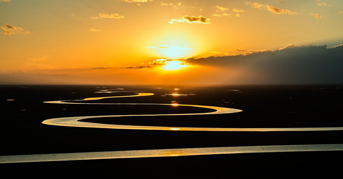
An S-curve feature is always interesting

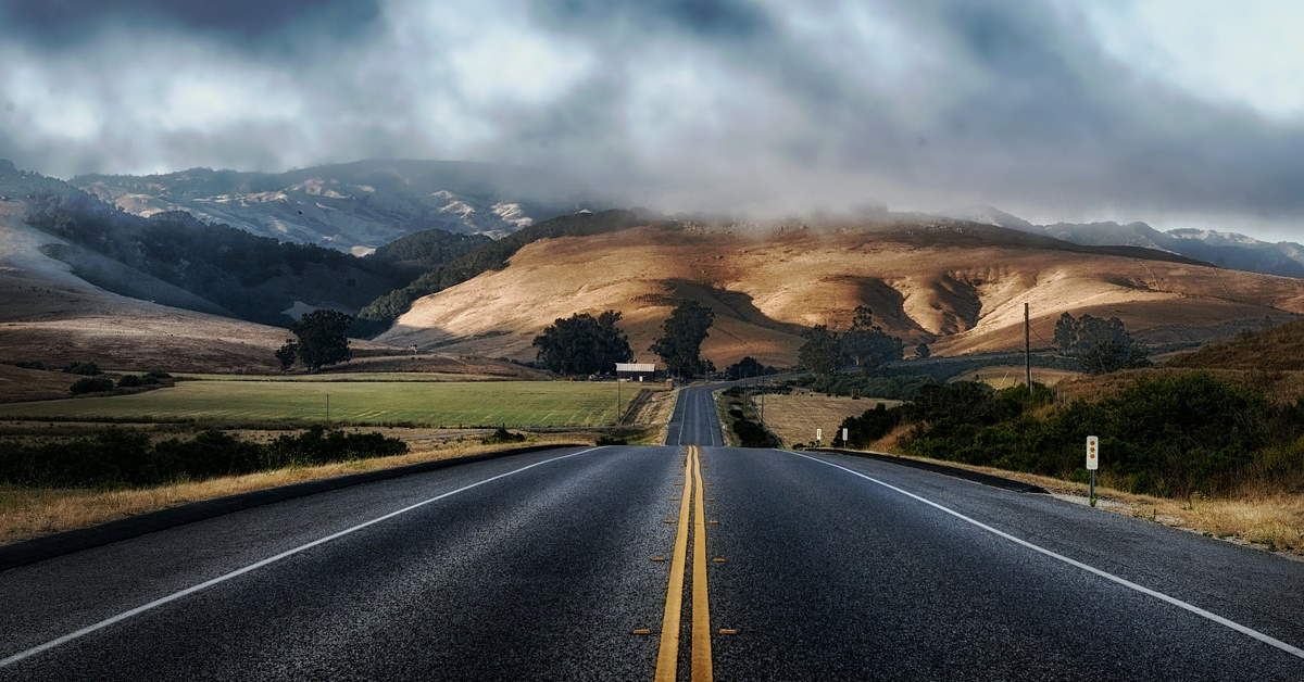
Slightly off-center, narrowing to a focal point
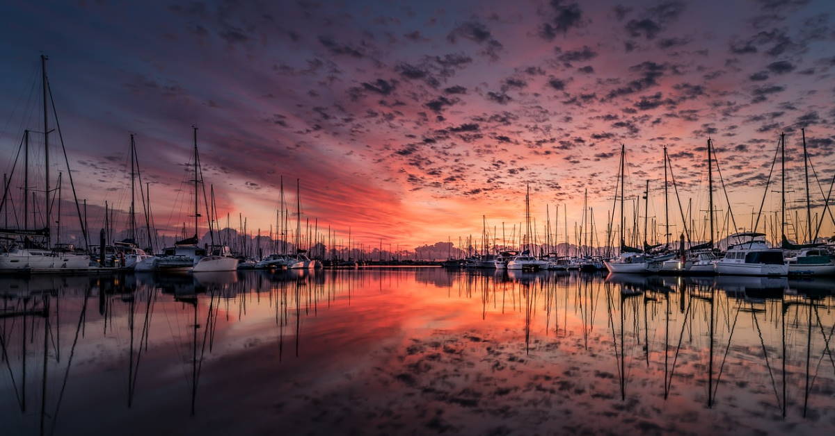
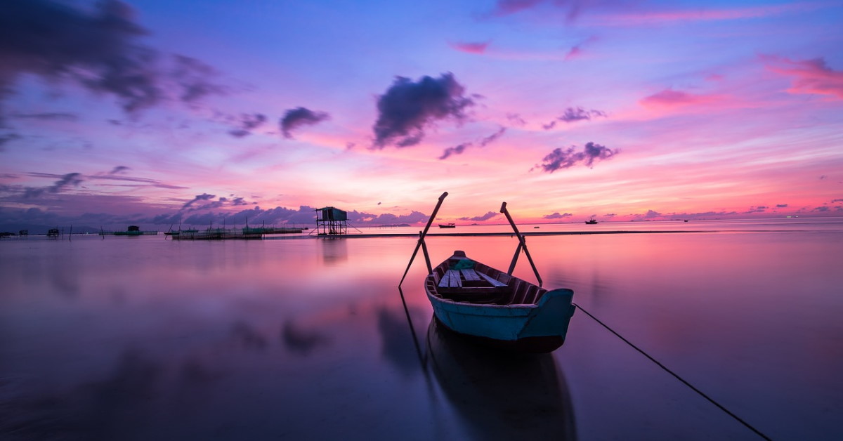
Off-center character in a landscape

TOOLS
Design templates - User & beginners friendly - https://www.canva.com/
Open Source photo editing software and advert creation - with learning curve - https://www.getpaint.net/
Open source - high level photo editing - high difficulty and logic level (like Photoshop) - https://rawtherapee.com/
Last but not least: remember that shop window on the high street we talked about? Your digital shop window is just as important, especially if you ONLY have a business presence online; so, remember that first impression is everything... and evoking an emotion can go either way... negatively or positively.
Share this Post
